BRANDING:
An Aussie Brand with a Delicious Personality
CLIENT:
The Arnott's Group
LOCATION:
Sydney, Australia
The Arnott’s Group has delighted consumers for over 157 years. They are the custodians of some of Australia’s most recognised food brands, including Arnott’s, Campbell’s, V8, Messy Monkeys, Freedom Cereals and 180degrees – to name a few. Their mission is to create delicious moments in all that they do, every day, and with everything they make.
I worked with Arnott's on a number of projects to enhance their overall brand and to move them closer to achieving two of their top goals: reconciliation and sustainability.


01
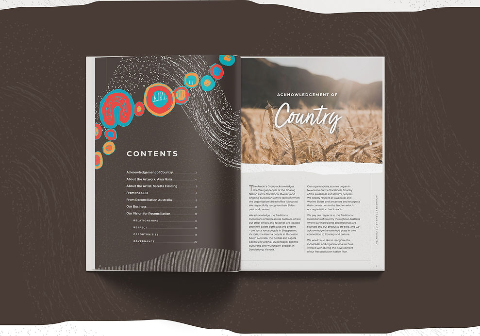
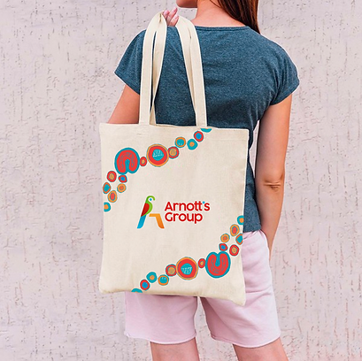
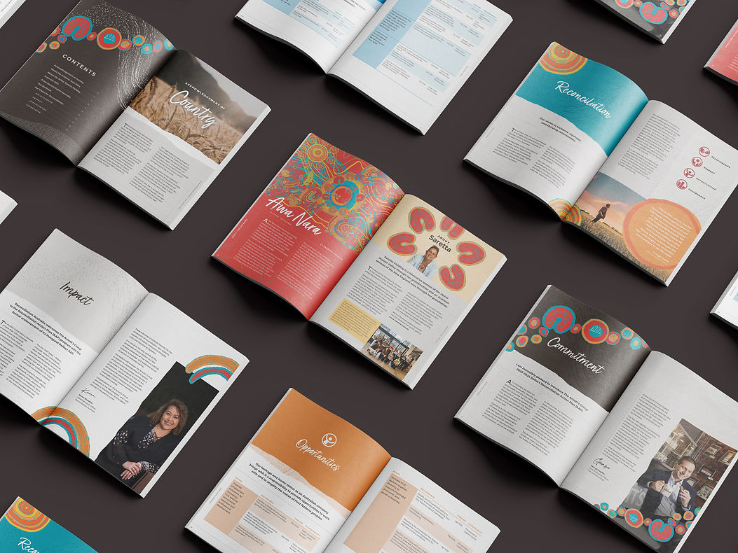
A reconciliation campaign
Arnott's recognises the importance of working with First Nations Peoples for the future sustainability and strength of the land they rely on and communities they connect with. Indigenous artist, Saretta Fielding was commissioned to paint an artwork symbolising the past, present and future of Arnott's. I developed a brand identity inspired by the artwork that works harmoniously with the overarching brand – an identity that celebrates indigenous culture. I developed a range of materials packaged into a wider campaign in anticipation of the launch of the 2023 Reconciliation Action Plan report.


02
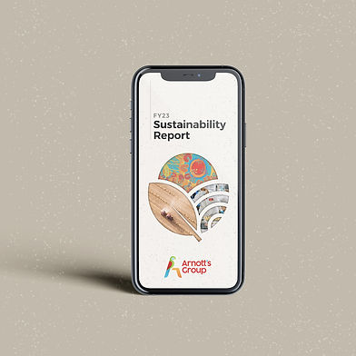
A sustainability campaign
Sustainability is an important priority of Arnott's. I worked with them on how they would convey this to their customers. I developed a number of graphics, reports, diagrams and data visualisations that proved to customers that real change is taking place at Arnott's to improve sustainability now and for future generations to come.

03
A delicious personality
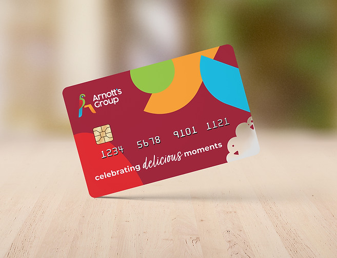
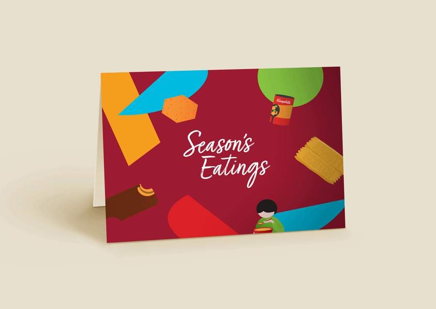
Arnott’s holds a special place in the hearts of Australians as one of the country’s most trusted and longstanding brands. An important element of the Arnott's brand is the playful, light-heart and approachable brand persona it has in the hearts and minds of it's consumers. There is always room to take a playful spin when working on graphics for a brand like Arnott's


04
A visual language
Keeping up with the light-hearted and approachable nature of the brand, I developed custom branded illustrations to help bring to life important themes and messages in a way that words could not. Illustration simplifies complex concepts, making them easier to understand. They transcend language barriers and communicate a universal message.

FEEDBACK
"Colleen is a game-changer. Her work is excellent and consistently delivered on time and on budget. Her creative vision and flexible approach make her an invaluable partner for our business."
Laura Backhouse
Internal Communications Manager, The Arnott's Group


